Highlighting different plot styles available when using Jupyter Notebooks
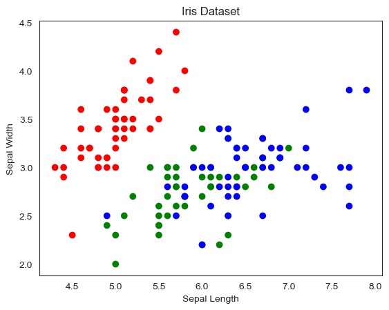
Plot in Matplotlib Iris Dataset
import matplotlib.pyplot as plt
import numpy as np
import pandas as pd

# Load the iris dataset
iris = pd.read_csv("https://raw.githubusercontent.com/mwaskom/seaborn-data/master/iris.csv")

# Create a scatterplot
fig, ax = plt.subplots()
colors = {"setosa": "r", "versicolor": "g", "virginica": "b"}
ax.scatter(iris["sepal_length"], iris["sepal_width"], c=iris["species"].map(colors))
ax.set_xlabel("Sepal Length")
ax.set_ylabel("Sepal Width")
ax.set_title("Iris Dataset")
plt.show()
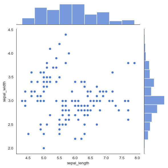
Seaborn JointPlot code for Iris Dataset
import seaborn as sns
import pandas as pd

# Load the iris dataset
iris = pd.read_csv("https://raw.githubusercontent.com/mwaskom/seaborn-data/master/iris.csv")

# Create a jointplot using seaborn
sns.jointplot(x="sepal_length", y="sepal_width", data=iris)
plt.show()
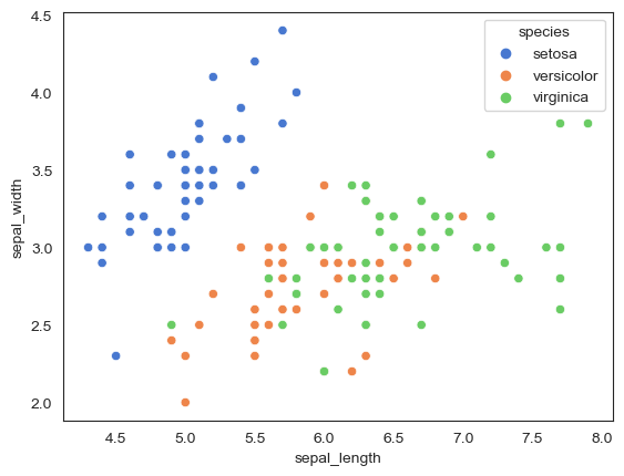
Seaborn plot
import seaborn as sns
import pandas as pd

# Load the iris dataset
iris = pd.read_csv("https://raw.githubusercontent.com/mwaskom/seaborn-data/master/iris.csv")

# Create a scatterplot using seaborn
sns.scatterplot(x="sepal_length", y="sepal_width", hue="species", data=iris)
plt.show()
Plotly Code for Iris Data Set
import plotly.express as px
import pandas as pd

# Load the iris dataset
iris = pd.read_csv("https://raw.githubusercontent.com/mwaskom/seaborn-data/master/iris.csv")

# Create a scatterplot using plotly
fig = px.scatter(iris, x="sepal_length", y="sepal_width", color="species")
fig.show()
Cufflinks Plot for the Iris Data Set
import cufflinks as cf
import pandas as pd

# Load the iris dataset
iris = pd.read_csv("https://raw.githubusercontent.com/mwaskom/seaborn-data/master/iris.csv")

# Create a scatterplot using cufflinks
cf.go_offline()
iris.iplot(kind="scatter", x="sepal_length", y="sepal_width", categories="species", colors=["red", "green", "blue"])
/Users/chrisgaughan/opt/anaconda3/lib/python3.9/site-packages/cufflinks/plotlytools.py:807: FutureWarning:

The pandas.np module is deprecated and will be removed from pandas in a future version. Import numpy directly instead.

/Users/chrisgaughan/opt/anaconda3/lib/python3.9/site-packages/cufflinks/plotlytools.py:810: FutureWarning:

The pandas.np module is deprecated and will be removed from pandas in a future version. Import numpy directly instead.
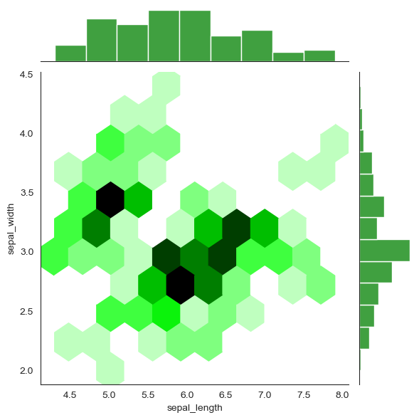
Seaborn Jointplot
import seaborn as sns
import pandas as pd

# Load the iris dataset
iris = pd.read_csv("https://raw.githubusercontent.com/mwaskom/seaborn-data/master/iris.csv")

# Create a jointplot with a hexbin plot and a different color
sns.jointplot(x="sepal_length", y="sepal_width", kind="hex", color="green", data=iris)
plt.show()
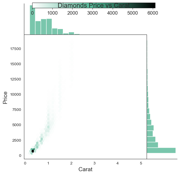
Seaborn Jointplot using Diamond Data Set
import seaborn as sns
import pandas as pd

# Load the diamonds dataset
diamonds = pd.read_csv("https://raw.githubusercontent.com/mwaskom/seaborn-data/master/diamonds.csv")

# Set the style to white
sns.set_style("white")

# Create a jointplot with a hexbin plot and a KDE plot
g = sns.jointplot(x="carat", y="price", data=diamonds, kind="hex", color="#4CB391",
                  space=0, ratio=4, marginal_kws=dict(bins=20),
                  height=6)

# Set the axis labels and title
g.set_axis_labels("Carat", "Price", fontsize=14)
g.fig.suptitle("Diamonds Price vs Carat", fontsize=16)

# Remove the top and right spines of the plot
sns.despine()

# Add a colorbar for the hexbin plot
cb_ax = g.fig.add_axes([.15, .95, .7, .03])
cb = plt.colorbar(cax=cb_ax, orientation="horizontal")
cb.ax.tick_params(labelsize=12)

# Show the plot
plt.show()
Written on March 7, 2023